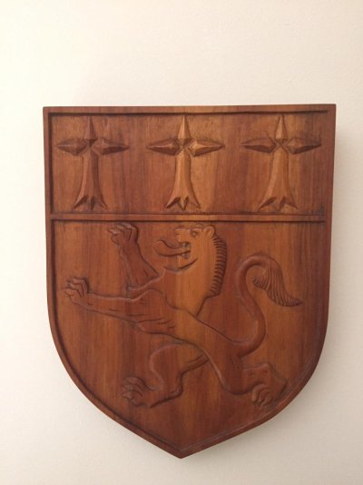
I knew it was not the Scottish flag, saw one recently on a boat here. Considered a modified Peugeot insignia.
From :
Peugeot Logo | Design, History and Evolution
Shape and Colors of the Peugeot Logo
The Peugeot logo is one of the most widely recognized and enduring car logos in history. It has played a tremendous role in establishing Peugeot as one of the most prestigious and sought-after automobile brands in the world. The logo has undergone various modifications over the years.
The history of the iconic “lion” logo of Peugeot traces back to 1847, when the company used to manufacture saw blades and steel goods. According to branding experts, the lion portrays three major attributes of Peugeot saw blades; the strong teeth, the elastic blade, and the swift cut. The logo first appeared on the “Peugeot Bros” arrow in 1950, and was registered as a trademark in 1858.
In 1889, Peugeot produced its first machine, a tricycle, as a result of successful collaboration between Leon Serpollet and Armand Peugeot. It was the first machine to bear the company’s name. The later vehicles sported the words ‘Automobiles Peugeot’ on the radiators. From 1905 to 1915, the lion logo on an arrow was displayed on the “Lion Peugeot” cars manufactured by Peugeot Bros.
In 1933, a more simplified and dynamic lion was seen on bonnets of the Peugeot cars. The heraldic lion, which is also seen on the coat of arms of Franche-Comté (the birthplace of the Peugeot family) started appearing on the 203 in 1948. When the company was renamed Peugeot S.A. in 1965, a few repairs were made to its corporate logo. The lion’s head was placed inside a triangular shield. A few years later, the same head was enclosed in a square-shaped structure.
In 1976, the PSA Peugeot-Citroën holding company was born after the merger of Peugeot and Citroën. The group then acquired the Chrysler Europe in 1978. In an effort to strengthen its corporate image, Peugeot reverted back to the heraldic lion, with a much refined and sophisticated design called “Lion fil”.
The Peugeot logo was altered once again in 1998. This time, the company added the paws to showcase the power and balance of its corporate identity. The blue, intense eyes symbolized the forward-looking attitude of the company. The current logo of Peugeot, often referred to as the “Blue Brand”, was unveiled in 2002. It contains an elaborated black hue that portrays the lion’s shadow.
The proportionally shaped Peugeot logo is often considered as one of the most visually spectacular car logos ever created.
The current version of the Peugeot logo incorporates a custom typeface specifically designed for the company by French type designer and graphic artist Christophe Badani.


 great !
