Whats your opinion?

The friendliest place on the web for anyone who enjoys boating.
If you have answers, please help by responding to the unanswered posts.
Legibility is one of my pet peeves. Really don't understand why people feel the need to make a game out or trying to determine a vessel's name through graphics, and frilly lettering. The object of the name on the stern of your vessel is to have someone be able to easily determine it and contact you over the radio. Often conditions aren't optimal, rain, fog, glare, or low light level. FWIW, the requirements are spelled out pretty clearly in the USCG regulations. Wish they would enforce them. Here's your ticket for being a PIA.

Ted
 
For rec vessels...it doen't really matter... I can clearly make out BOKU (except for the ones with the extras over the letters which could be out of reg)...and MANY rec boat names, through the years I couldn't venture to even guess the spelling because of the font or graphics.


I think the basic requirements are it can be seen and using Arabic style letters...but BLOCK is only required (and often ignored) on commercial vessels (so I am not absolutely sure that is true).


Regardless of the requirements, I think it's a courtesy to other boats to display an easily legible name. It's no different from manning the VHF, which unfortunately many people don't do either. I have the same gripe with boats where the tender is hauled up on the transom and blocks an otherwise legible name. The best solution I've seen to that is to replicate the name of the boat in lettering on the bottom of the tender so the tender becomes a flip-up sign. Simple, yet effective.
 
I would opt for number 3, as the letters are easier to make out. I would also agree with the comments that the name color should be darker to be more legible at a distance.

Boat names can be challenging. I have a 15' West Wight Potter that I named "Coqui". A coqui is a small frog in Puerto Rico that has a loud mating call. It's beloved on the island and has been a part of the Puerto Rican culture since the native Taino people. As my little boat brought me a lot of joy, I named it "Coqui" and have a frog as part of the graphics. :) On the Big Island of Hawaii, however, coquis are an invasive species with few natural predators and are considered a pest and are part of an eradication campaign! :nonono:

Jim
 
Hmmmm, maybe I will use 8 inch black letter and rename my boat FRED.
 
One can put the name of their boat on the aft starboard side.
I have seen it done.
 
I agree about legibility.. ..I have block letters, have a separate sign with name & homeoort that comply with size because of my dingy, man my radio, laugh at silly names, etc, etc..


But I know most boaters aren't serious boaters.... Pretty over functional, easy over safe, cheap over reliable, fun over technical, popular over traditional, etc, etc...


Most survive their lifetime of boating, rescuers find them in time, etc...etc...


Again, while it still bothers me a tad....even the USCG doesn't seem to find it necessary to change the rules.
 
Eibher or both sides is OK.

I was thinking starboard side because my helm is on the starboard side.
I do have the name and hailing port on the stern but that is blocked when the RIB is in the davits.

I do have name boards on either side of the house.
 
Last edited:
I agree about legibility..

But I know most boaters aren't serious boaters.... Pretty over functional, easy over safe, cheap over reliable, fun over technical, popular over traditional, etc, etc...

I say 'get over it'. Put the BIG black letters on the stern. The USCG does specify 'a contrasting color'. So if you have a black hull, better use white.

I personally find it difficult to read red letters.
 
Your helm position really doesn't have much to do where a name goes....

And "contrast" is in the "eye" of an LEO, then the hearing officer.


If it were that "black and white", the regs may state just that.
 
I like the graphics and name! My preference is option one because it is the most legible. Will it be dark enough to provide enough contrast? I had my name painted as I am not a fan of vinyl lettering.
 
Your helm position really doesn't have much to do where a name goes....

And "contrast" is in the "eye" of an LEO, then the hearing officer.


If it were that "black and white", the regs may state just that.

I do believe the USCG regs specify size.

I must confess, (I had to go look) my green hull boat's name
is script gold with white edges.... KINJA About 12 inches in height.
The hailing port is white block letters, is in compliance with the USCG regs, 4 inches.
 
Last edited:
My opinion which is worth every penny you paid for it is that it's a great name. Much much better than some I've seen. I think it's completely irrelevant whether some company uses it. If it has meaning for you, go for it.

(In the very bad name category there is a boat near here who's name is "My Day" I think I understand it but can't imagine why the Vessel Documentation Center allowed it.) imagine calling them on 16....

Ken
 
Regardless of the requirements, I think it's a courtesy to other boats to display an easily legible name. It's no different from manning the VHF, which unfortunately many people don't do either. I have the same gripe with boats where the tender is hauled up on the transom and blocks an otherwise legible name. The best solution I've seen to that is to replicate the name of the boat in lettering on the bottom of the tender so the tender becomes a flip-up sign. Simple, yet effective.

I agree! On both the radio monitoring and the "Weaver davit" solution to dinghy stowage.
 
I think the name is ok - pick a better font. As a traditionalist I prefer capitals for at least the first letter and a much darker colour. I think the name is obvious without the accents. Its not too cutesy, not quite a pun and its your boat! The palm trees are cheesy.

I saw a boat here called “Payday” which is totally moronic, people calling him caused panic all over the coast, especially at long range where reception was marginal.
 
...because someone brought up the word "cheesy" which I can understand in a traditionalist sense...;)


to go along with that thought....please don't fly a pirate flag and play Jimmy Buffet too loudly. :eek:


I can live with the palm trees, and I do like old Jimmy....but never the pirate flag and all three would cause me to fire a 10 pound parrot gun shot across your bow upon entering the anchorage.... :rofl:


Just kidding (sorta...:thumb:)...hey it's your boat...enjoy....just try and color inside the rules lines.
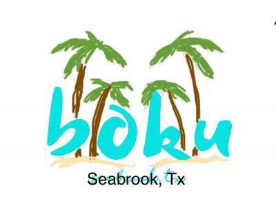

 
So what do you think about the new graphics to go on the transom? 1, 2, or 3?


None of them are good for reading from a boat behind you somewhere, maybe bounding a bit in waves, maybe using under-powered/unstabilized binoc, etc. Plain block letters, large, black typeface on white boat, are easier to see, easier to decipher...

Not uncommon for us to want to hail a boat ahead of us... but we can't call by name because we can't make out the fancy fonts...

-Chris
 
Here is my 2 cents. If you like the name then go with it, just make make sure you perform the renaming ceremonies. Our boat used to be named Floating Intrest and now it’s Guns ‘N’ Hoses II. I played with a couple of the pics you posted and this is what I came up with. BTW, there is no charge for the artwork since it’s looks like it was done by a kindergartner but I think you get the overall idea.
 

Attachments

  • 7DF46485-B45D-483E-984C-8C7D8FE70D66.jpeg
    7DF46485-B45D-483E-984C-8C7D8FE70D66.jpeg
    15.2 KB · Views: 276
  • C1B9766D-4D81-4646-8AD3-042F7720E315.jpeg
    C1B9766D-4D81-4646-8AD3-042F7720E315.jpeg
    13.2 KB · Views: 285
Last edited:
I like the name! The graphics not so much. I agree with all the others on legibility. I'd also ditch the palms.
 
I can settle this once and for all.


:rofl:
hot-pink-unique-hot-pink-acrylic-colour-sample-splash-acrylic-of-hot-pink.jpg
 
... to go along with that thought....please don't fly a pirate flag and play Jimmy Buffet too loudly. :eek:

I dont care what type of music you play but, if I can hear it, it's TOO loud.
 
You did not mention if the boat was going to be documented or not... if so I'd suggest reviewing the reqmts for name & more importantly home port.
I dont think any of the home port choices would meet doc reqmts.
Clear Legibility at a distance is a valid comment IMO


It's already USCG documented.
 
Regardless of the requirements, I think it's a courtesy to other boats to display an easily legible name.

Unfortunately we'll have to agree to disagree. For the amount of money I'm paying for MY boat, I'll write it in chinese if I like. I'm not doing this out of courtesy for others, unless they're willing to pay for it.
 
I have been playing with it a bit :)lol:) and came up with something more graphic.
 

Attachments

  • 66288808_325779628372294_9045647432607596544_o.jpg
    66288808_325779628372294_9045647432607596544_o.jpg
    64.8 KB · Views: 48
Unfortunately we'll have to agree to disagree. For the amount of money I'm paying for MY boat, I'll write it in chinese if I like. I'm not doing this out of courtesy for others, unless they're willing to pay for it.
If a LEO writes you a piece of paying paper to fill his monthly quota, I hope you have the nerve to tell the judge what you just wrote.

Ted
 
If a LEO writes you a piece of paying paper to fill his monthly quota, I hope you have the nerve to tell the judge what you just wrote.

Ted


I work in law enforcement, I've never heard of a citation being written for "illegible boat name."
 
LE doesn’t usually write tickets for an illegible name but they certainly can if they want to. If they are looking for a reason and your name isn’t readable then you just gave them the reason. Why not just follow the rules and add whatever graphics you want to? Besides when someone is trying to read the boats name in order to call you to ask for a slow pass, why not make it easy to call you?
 

Latest posts

Back
Top Bottom