TF Burgee Final Logo poll... 4 Days To Vote.

The friendliest place on the web for anyone who enjoys boating.
If you have answers, please help by responding to the unanswered posts.

FINAL POLL FOR TF BURGEE LOGO

  • Logo 1

    Votes: 38 52.8%
  • Logo 3

    Votes: 34 47.2%

  • Total voters
    72
  • Poll closed .

firstbase

Guru
Joined
Nov 6, 2016
Messages
1,644
Location
United States
Vessel Name
Black Eyed Susan
Vessel Make
Grand Banks 42' Classic
NEW NEW NEW...TF Burgee Final Logo poll...DOWN TO TWO.

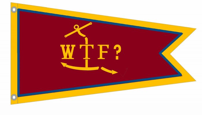
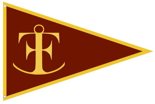
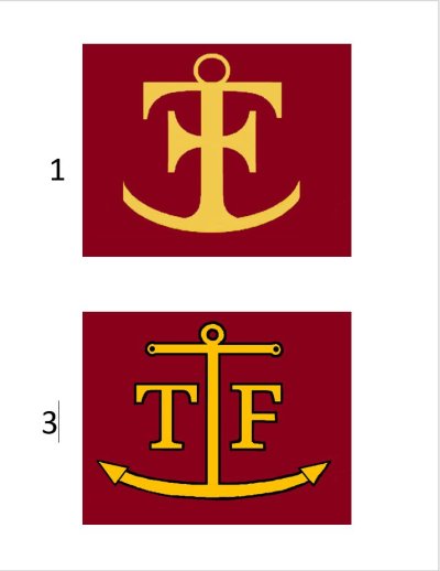
Here are the two finalists with a small amount of artistic license applied to make them better quality and to adjust for some changes suggested by your Exec. Committee. Note that Art's well known fav, #3 is still #3. I put them on a representative burgundy background just to give them a little flavor. Not a final color choice. That's up to you guys.

1. No multiple choices this time, vote for one or the other.

2. One has a black outline, the other doesn't. That can be changed if members prefer after it is selected.

3. Yes, #2 has changed a little to beef it up somewhat and to make it higher resolution. Committee decision that the scrawny look was a bit too scrawny and had to go plus all of the amateur Photoshopping had degraded it. The original was not the greatest as it was taken from a low resolution jpg of the motto. Messing with it numerous times just made it worse.

4. Number 1 can be done as a single side / reverse image. Number 2 needs to be a true double sided. However, we have done some preliminary pricing and it is not much more to go with double so it shouldn't be much of a factor.

Here is one set of pricing as an example. PLEASE NOTE....these are burgee prices only without shipping and handling. they are also from one particular vendor. We are still searching out others:

"Finest embroidered" would be $150-$200 apiece. No price break as they are all done individually. (Hey, I said I would ask and I did)

If we order 25 units they are $22/each in Single Side / Reverse Image or $34 each for true double sided.

If we order 50 units they are $19/each in Single Side / Reverse Image or $29 for true double sided.

There are two other options if we want them "bullet proof". X box stitching and Teflon thread. I am waiting on pricing for those upgrades.
 

Attachments

  • Final Logo Poll Choices.JPG
    Final Logo Poll Choices.JPG
    48.9 KB · Views: 640
Last edited:
Thanks!

May be the iPad but I’m only seeing two choices....
 
#1 since it doesn't need a reverse side. Keep in mind that they will wear and you will be needing to reorder at some point. I believe it will be a conversation starter due to its unique design.

To my eye #2 could be interpreted as a personal burgee for someone whose initials are TF. Thanks for all the great work on this project. Howard
 
Last edited:
I've switched my choice...now prefer #1 because it's not so literal and has a secret password or handshake required aspect to it.
 
Greetings,
Will there be a $3.97 option?

RTF, now do you think we would leave you out?!?! Not a chance. $3.97 is enough to get you in the game. I worked out a deal just for you....here you go. Fly it proudly!!
 

Attachments

  • RTF397.jpg
    RTF397.jpg
    50.9 KB · Views: 82
I've switched my choice...now prefer #1 because it's not so literal and has a secret password or handshake required aspect to it.

Password, handshake and...a decoder ring. The decoder ring is key.
 
Thanks all! Good pricing too, better than I found!
 
My preference is number one only because the anchor looks like it will work better in my cruising area. Both are very nice.
 
I chose logo 3 as I felt most (who don't know) wouldn't see the letters in logo #1. It looks more like an ornate anchor on a burgee.

Ted
 
Leave it to Ted to come up with a logical reason. :)
 
I chose logo 3 as I felt most (who don't know) wouldn't see the letters in logo #1. It looks more like an ornate anchor on a burgee.

Ted

EXACTLY the reason I chose the lower burgee design! i.e. #3!! :dance:


Last edited:
If any of you have a particular view on the background color, black (or other color) outline, shape, placement etc. now would be a good time to put up your thoughts. Maybe we can cut down on the guess work and putting up examples that won't fly.

"Examples that won't fly". I crack me up. :)
 
If any of you have a particular view on the background color, black (or other color) outline, shape, placement etc. now would be a good time to put up your thoughts. Maybe we can cut down on the guess work and putting up examples that won't fly.

"Examples that won't fly". I crack me up. :)

I went with #1. I made the original #3, but I don't really like the chunkier version of it. I also never really loved the letters on it either. I like that #1 carries all of it's symbolism in a simple logo, rather than spelling anything out in letter form. I also think that the bigger, bolder logo will be more easily recognizable from a distance.

I like the red background, gold anchor, and some sort of border around the edge, likely also gold.

I also like the way the black outline around the logo makes it pop, but the simplicity of a two color scheme is good, too.

If the cost isn't too crazy, I like the heavy duty construction option.
 
I chose logo 3 as I felt most (who don't know) wouldn't see the letters in logo #1. It looks more like an ornate anchor on a burgee.

Ted

Ted - that's the secret handshake aspect :ermm:

or New and Improved for another anchor TF debate Oh No :facepalm:

Those who don't know wouldn't have a clue what TF is either...
They may assume the "W" fell off and is WTF ???
 
That blue header where it says the time and post number would make for a nice three colour combo :thumb:
 
Ted - that's the secret handshake aspect :ermm:

or New and Improved for another anchor TF debate Oh No :facepalm:

Those who don't know wouldn't have a clue what TF is either...
They may assume the "W" fell off and is WTF ???

An interesting question: Is the burgee about identifying other members of the secret society or promoting the forum? I tend to learn towards the later and really felt the burgee should promote curiosity from those who don't recognize it ( thing the AGLCA burgee does that extremely well). Having a burgee for the secret society will probably only get me to fly it at rendezvous. May be time for me to work on the TF rendezvous burgee.

Ted
 
That blue header where it says the time and post number would make for a nice three colour combo :thumb:

Here you go. I haven't posted this one before. Sort of my personal favorite...just to give examples of those three colors, getting the header blue color you mentioned in there...
 

Attachments

  • WTF Burgee.jpg
    WTF Burgee.jpg
    49 KB · Views: 50
  • WTF Burgee2.jpg
    WTF Burgee2.jpg
    48.5 KB · Views: 55
Last edited:
Greetings,
Mr. OC. "May be time for me to work on the TF rendezvous burgee." Nope. There already is one....


th
 
I went with #1. I made the original #3, but I don't really like the chunkier version of it. I also never really loved the letters on it either. I like that #1 carries all of it's symbolism in a simple logo, rather than spelling anything out in letter form. I also think that the bigger, bolder logo will be more easily recognizable from a distance.

I like the red background, gold anchor, and some sort of border around the edge, likely also gold.

I also like the way the black outline around the logo makes it pop, but the simplicity of a two color scheme is good, too.

If the cost isn't too crazy, I like the heavy duty construction option.

This is sort of what I was thinking when I came up with the anchor design......:hide:
 

Attachments

  • TF Burgee.jpg
    TF Burgee.jpg
    41.1 KB · Views: 54
This is sort of what I was thinking when I came up with the anchor design......:hide:

Yep, a goodie. At some point the horns got less hornier (sort of like Mr. RTF as he aged). I don't really remember why actually. The logo that is, not RTF. Someone somewhere mentioned clipping them a bit so I did. I believe I thought that the sharper horns looked like, well, horns. trumpets of sorts. The clipped looked a little more like letters? Who knows. It was late. :)
 
Last edited:

Latest posts

Back
Top Bottom