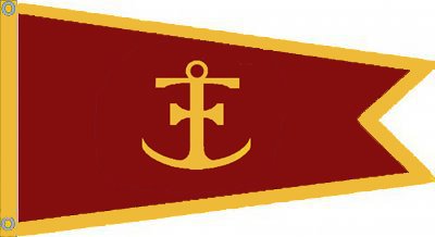
firstbaseI'm going to get drummed out of the corp for highjacking other peoples art so my apologies. Still playing, rough draft, combined rochepoint's anchor and the nice Bacchus swallowtail. I bulked it up a little and made it thicker as was suggested. Not sure if a logo should be centered on a burgee, offset towards the staff? Tried to make the logo as large as possible but may have gone too far with it. This would work as a one sided burgee, mirror image on other side, which will keep the cost down a bit. Anyway, just another shot at it and again my apologies to rochepoint and Bacchus.
No apologies necessary - at least as far as I'm concerned - actually I stole the background & concept Wayfarer posted all I added was some refinements.
I like to think we are building on each others ideas vs stealing.
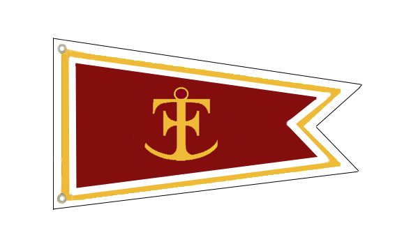
There is a wide range of graphic / techie capability here - not everyone is able to manipulate / modify these designs.
If we can ever decide on a design we will likely need to find someone to produce a good clean, high quality digital file to provide to the flag maker or pay them to do it for us?
An additional thought I had after seeing these and reading some of the comments - wonder if anyone that doesn't want to or have the location for a Burgee would prefer a decent sized decal to place on a dock side window or vehicle with the same logo & burgee shape?
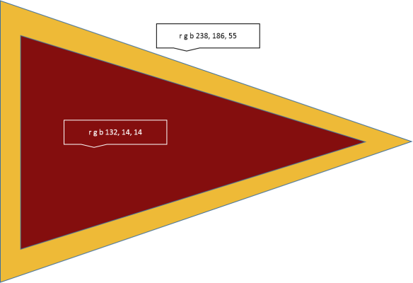
I did some digging and find the specs for both the "Red" and Gold colors used on the TF site. I juts don't know how to modify / manipulate the image to duplicate them - although the recent design red looks like a very good match.
"Red" (r, g, b, a) = 132, 14, 14, 1
The speced gold accent on the website is
Gold (r, g, b, a) = 189, 147, 71, 1
But it seems a little dull and could use some adjusting
r, g, b = 238, 186, 55 looks better
now if I could only figure out how to cut / pastE color swatches !!!
Got it will attach a color swatch as an example - can fine tune if necessary
This is the exact TF Maroon and a gold a little brighter than the website horizontal bar accents
Attachments
Last edited: