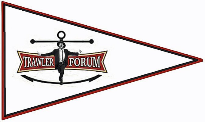
TF Burgee

The friendliest place on the web for anyone who enjoys boating.
If you have answers, please help by responding to the unanswered posts.
....On this field of color place the TF "anchor" only---no words at all.....

When you say "TF anchor" do you mean the anchor in the logo but take everything else out? Get rid of the "Trawler Forum" and Latin verbage in the center?
 
Last edited:

WRONG ANCHOR!!! (Just sayin'...)


100.gif
 
I agree that we should take the step of bringing some of the ideas presented here to a burgee manufacturer to get prices and recommendations.

My own opinion is that the full logo looks great on a web page, but may be too complex for a burgee flapping in the wind. That said, if a burgee with the full logo is reasonably priced, and the manufacturer says it'll come out OK, I'd be OK with that.
 
For a point of reference I just had a flag made. It was double sided and printed not embroidered. Uploaded my own artwork. A very nice and seemingly excellent quality flag and it was $90.00. I would imagine an embroidered version would be another 50% higher but not sure.


I still pick this direct and to the point TF burgee design from post #27... "rochepoint"

I'll purchase one very similar to the above. I will not purchase one with colors portending to hold a secret code... for those only in "The Know - i.e. for members only to recognize!

The burgee design shown above will help for beginning conversations with boaters not in "the know" of TF. After all... isn't that what we all want... i.e. more good hearted and knowledge filled boaters to join TF? Isn't that the basis of the origination of TF?
 
Here's my 2 cents worth;
I suggest a pennant shaped burgee with the TF colors of gold, black and maroon. On this field of color place the TF "anchor" only---no words at all. I don't think a burgee should be a form of advertising. Those of us who use the forum will recognize the burgee, others may ask what it is, and it won't need to be double sided. I would draw one but I am so artistically lame. Thanks

:thumb:

Howard, when did you become sensible? :rolleyes:

Ted
 
We could always get closer to the point and remove everything except the anchor and the TF title in red background. But have center shank of anchor touch top and bottom of the red insignia [maybe leave a tiny white space in that location between shank and logo]. And, enlarge the insignia a bit so it is more easily read.

:popcorn:

 
I'd suggest that anyone interested in submitting a design review the recommendations from the Burgee Shop

They have some pretty good info, Do's & Don'ts and sample designs.
It looks like they will review and comment on potential designs and provide a service to register a burgee design once it's completed.
Both seem like reasonable steps after we have a design candidate.

I don't mean to discourage any of the creativity of interested members but I do think we should try to be practical. Above link and info below right from the manufacturers. Worth considering.....

A few excerpts from the link above...

  • If a star, triangle, circle or some other symbol is appropriate, use it on the flag, but try to keep it simple.
  • The above are examples of appliquéd burgees which are the preferred method of making burgees. The fabric is cut out and sewn on both sides with the same stitch. (printed is another option but less durable IMO)
  • Keep the flag design to about two or three colors.
  • Wind is the number one reason flags fail, and if it is a windy area where your flag is to be flown, a pennant or swallow tail may last longer than a rectangular flag. UV From the sun is the second reason why flags fail.
  • What to avoid, is lettering on the flag. This increases the complexity of the flag, and appliquéd the letters will read in reverse on the back side. If letters are to be employed, keep the number of letters to a minimum and keep them simple block letters. Read more about letters
  • For examples of what are good flags and what not do to, see this sample flag page
 
When you say "TF anchor" do you mean the anchor in the logo but take everything else out? Get rid of the "Trawler Forum" and Latin verbage in the center?

Yes, exactly. Just the anchor.
 
I'll purchase one very similar to the above. I will not purchase one with colors portending to hold a secret code... for those only in "The Know - i.e. for members only to recognize!

The burgee design shown above will help for beginning conversations with boaters not in "the know" of TF. After all... isn't that what we all want... i.e. more good hearted and knowledge filled boaters to join TF? Isn't that the basis of the origination of TF?

Oh man, Marin would have a field day with this. :popcorn:
 
Oh man, Marin would have a field day with this. :popcorn:

Bring him on!! He and I have spared before with a couple of placement fights too! :thumb: :lol: :thumb:

Only a person with blinders on could disagree with what I said. :popcorn:
 
:rofl:
Greetings,...IF, on the other hand, the owners of TF would foot the bill for the "advertising", I'm all for it and would like two (2) please...


200.gif
:rofl::rofl:
 
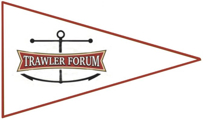
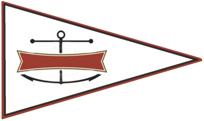
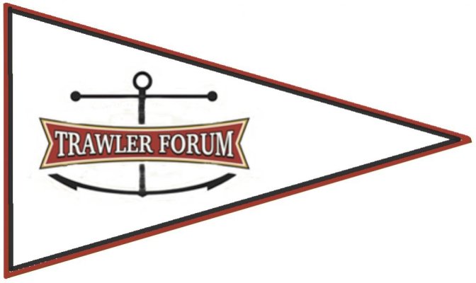
Draft versions of what I think was described. Sort of. I think.
 

Attachments

  • Trawler forum2.jpg
    Trawler forum2.jpg
    40.8 KB · Views: 38
  • Trawler forum3.jpg
    Trawler forum3.jpg
    184.9 KB · Views: 36
And with two tone trim...
 

Attachments

  • Trawler forum4.jpg
    Trawler forum4.jpg
    39.9 KB · Views: 31
  • Trawler forum5.jpg
    Trawler forum5.jpg
    44.9 KB · Views: 43
Pick 2 colours and just have T F on it. Nobody knows what a burgee stands for if they have never seen it before, it has to be simple and bright and yes, you will have to explain what it stands for. Put the T over the F and you can sew both sides at once.
 
One of us, wont say who, will probably prefer this one. The result of me having too much free time while watching the Boston-Houston game....
 

Attachments

  • RTF.jpg
    RTF.jpg
    59.2 KB · Views: 39
One of us, wont say who, will probably prefer this one. The result of me having too much free time while watching the Boston-Houston game....
[emoji106] [emoji106]
 
One of us, wont say who, will probably prefer this one. The result of me having too much free time while watching the Boston-Houston game....

Now, that's marketable! :rofl: I could get behind that one. :D Talk about a burgee that starts conversations!!! :thumb: :lol:

And, with a secret inside-joke included that only tried n' true TFers would/could relate to...

Of course, whomever you are referring to regarding that cartoonish character now added into, preliminary-design burgee mix, must promise to never alter his TF moniker; err avatar. Fame arrives in unexpected ways. Although he's pretty famous [maybe even just an inkling infamous] already amongst TF contributors!
 
Last edited:
Greetings,
Mr. fb. While I am somewhat flattered, you are living proof of what happens when one over self medicates.


giphy.gif
 
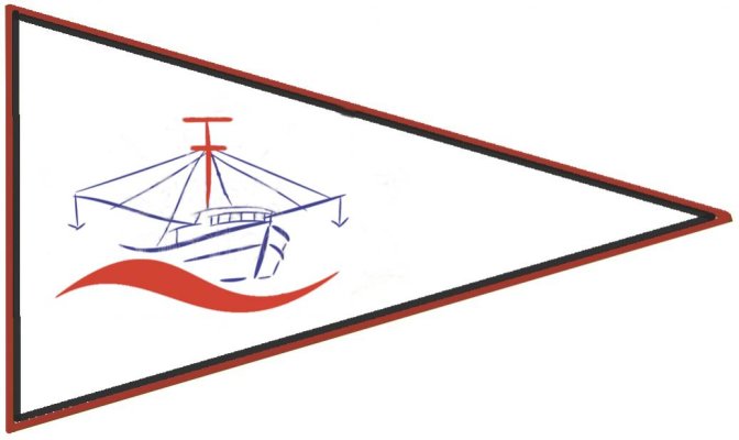
Another very rough concept...hard to work in the forward and backward TF and still retain some anatomical correctness. This guy's radar can see all the way to China. Graphic could be a bit bigger but ...concept.
 

Attachments

  • fishing-trawler4.jpg
    fishing-trawler4.jpg
    41.9 KB · Views: 46
Last edited:
Greetings,
Mr. fb. While I am somewhat flattered, you are living proof of what happens when one over self medicates.


giphy.gif

Possibly...or a baseball game goes 4 1/2 hours! Actually love playing in Photoshop and no matter what silly project I invent I learn a little more.
 
Another very rough concept...hard to work in the forward and backward TF and still retain some anatomical correctness. This guy's radar can see all the way to China. Graphic could be a bit bigger but ...concept.


Not bad... however, line drawing of a "working" Trolling boat does not represent my tri cabin pleasure boat. Nor I believe does it represent the boat of a very large amount of other TF contributor's.

Also, I feel that even if not spelled out in full there should at least be the acronym of "TF" included on the burgee... ya know... to have questions asked and to start conversations with.
 
Does anyone have a hi-rez version of the full logo?
 
One of us, wont say who, will probably prefer this one. The result of me having too much free time while watching the Boston-Houston game....
I'll buy one of these, if RT provides a bottle of Monkey Fist!:angel:


Not bad... however, line drawing of a "working" Trolling boat does not represent my tri cabin pleasure boat. Nor I believe does it represent the boat of a very large amount of other TF contributor's.

Also, I feel that even if not spelled out in full there should at least be the acronym of "TF" included on the burgee... ya know... to have questions asked and to start conversations with.


It was concept only. In searching for art it gets difficult quick. Your three cabin doesn’t represent someone else’s woodie with no fly ridge which doesn’t represent...etc. I was trying to come up with a front on view of a non descript hull. Even tried lofting lines. Thought I’d go with thos one to start.
 
It was concept only. In searching for art it gets difficult quick. Your three cabin doesn’t represent someone else’s woodie with no fly ridge which doesn’t represent...etc. I was trying to come up with a front on view of a non descript hull. Even tried lofting lines. Thought I’d go with thos one to start.

Naw - Just PM me! :dance: :lol:

BTW... I realize your burgee design was an at the moment thang! And, I'm mot sure what "hull" or "boat" shape would best fit the bill. Maybe I could suggest in the wide portion to just have a boat's bow at 45 degree angle; its wave showing curling up toward the bow sprit / pulpit. With not too much of remainder of boat showing. Then... in the more narrow portion place the Trawler Forum logo.

Awful EZ for me to give instructions! :lol: I have no l time nor expertise to try my hand in the design process... :socool:
 
Last edited:
I'll purchase a TF burgee as long as the cost isn't outrageous. I'll buy a TF burgee even if the general consensus settles on a crappy design.


That said, my preference would be:
- Simple design that works without creating a double sided flag. This makes it less expensive.
- Nothing complex, such as the TF logo.
- Something that stands a chance of being recognized at a distance with binoculars.


Of course, I've already discounted my preferences by indicating that I'd go along with the TF concensus regardless.
 

Latest posts

Back
Top Bottom