twistedtree
Guru
Please correct me if I am wrong as I rarely use vector charts seriously...
But isn't that the issue beep ween the 2 types of charts for the most part?
Too often detail is lost on vector charts if not zoomed in enough where most of the time the raster has the detail but may be an awkward chart to use on a small screen?
If not I am sorry to mislead anyone, but that was true in the earlier years and why I stick with raster charts. I might be behind now, bUT the raster charts are what I am most comfortable with.
So in answering the paper chart vs electronic chart question....maybe.
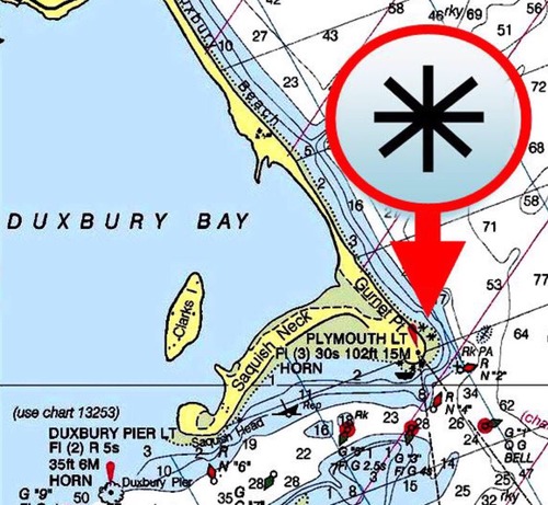
And maybe if raster charts were used and not vector, maybe the dike would have been more apparent.
But all a guess.....
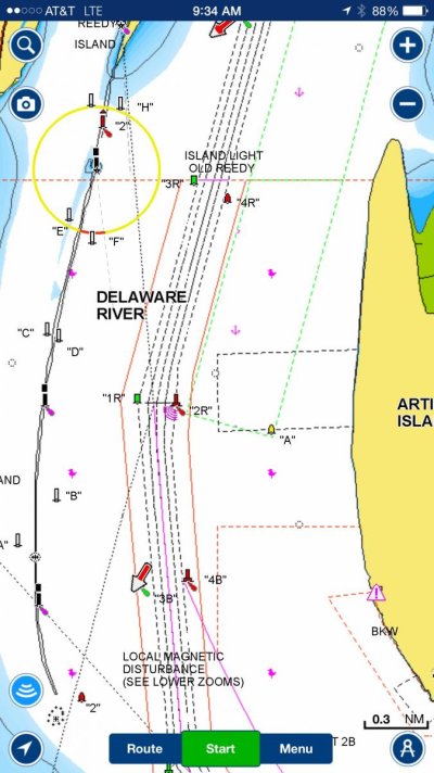
I just took a look at the NOAA vector charts for the area. The dyke shows at all scales up to 1:150,000. Above that it doesn't show.
On the raster charts, there is one at 1:40,000 which shows the dyke. Then it jumps to 1:1,200,00 and does not show the dyke.
And the symbology is identical between the raster and vector charts.
It just goes to show that if you pick the wrong scale chart, paper, raster, or vector, you can miss vital detail. Turning it into a paper vs electronic debate, or a raster vs vector debate misses and confuses the real issue. It's about the inherent difference between charts at different scales, and making sure you are checking the full spectrum. In this case it was a non-issue, but in other disasters it was very much the issue.
")