The discussion here about chartplotters and apps, and especially the charts made me revisit my understanding of the state of things. It cannot hurt to have yet another backup on my Mac. So sometime earlier this week I have downloaded OpenCPN, plus some NOAA raster and vector US charts. I could not get any Canadian charts … I am sure they are available somewhere for download for a fee.
Some background ... in addition to waterproof paper "raster" charts based on government issued charts, I use two Garmin chartplotters at helm with their BlueCharts G2 Vision charts loaded, plus an iPad. The iPad is loaded with various nav apps and charts that are available from the vendor who offers the app. I use iPad, and specifically Navionics app and charts, as a backup and route planning and tracking tool.
Back to OpenCPN and NOAA charts … NOAA charts, especially raster charts have not added anything to what I already have … actually as the raster version is concern, I prefer the paper charts as the user interface is much better and faster …
")
When it comes to charts, IMO, the difference between NOAA raster and NOAA vector is not that significant. The real difference between charts comes from the added value provided by different chart publishers and/or app vendor. Please look below, and draw your own conclusions.
Below is a series of screen captures with some comment. Since I have dumped the OpenCPA, the NOAA charts are shown using demo MacECN application that I happened to have on my Mac. Click on images below to see full size and more details.
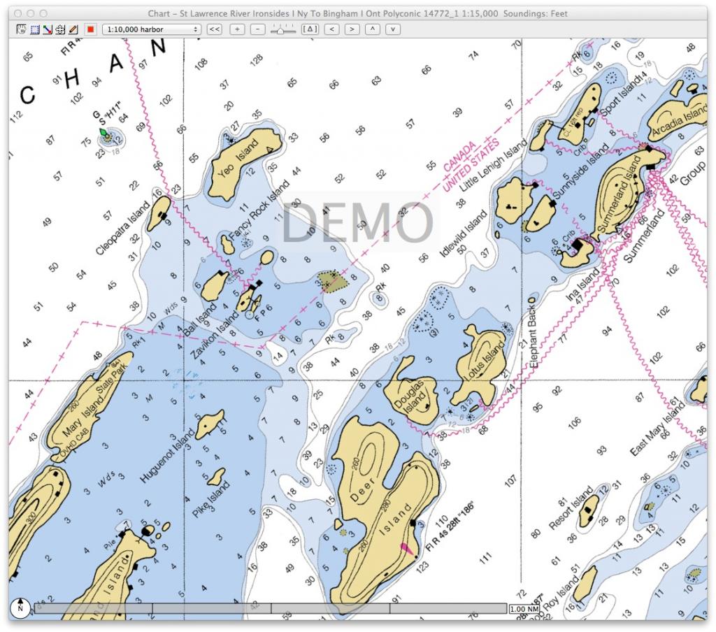
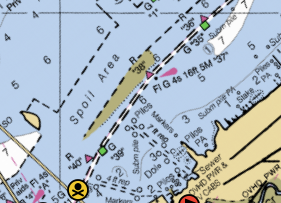
NOAA Raster chart ... using MacENC application …
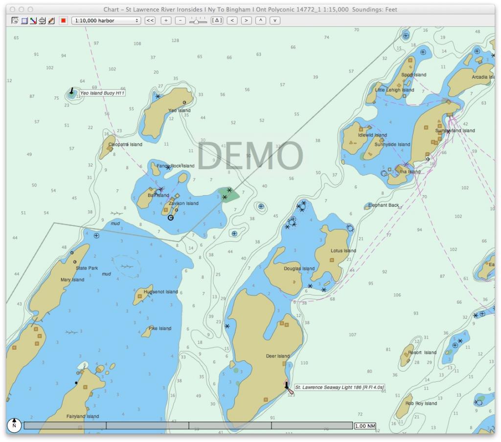
NOAA Vector chart ... using MacENC application …
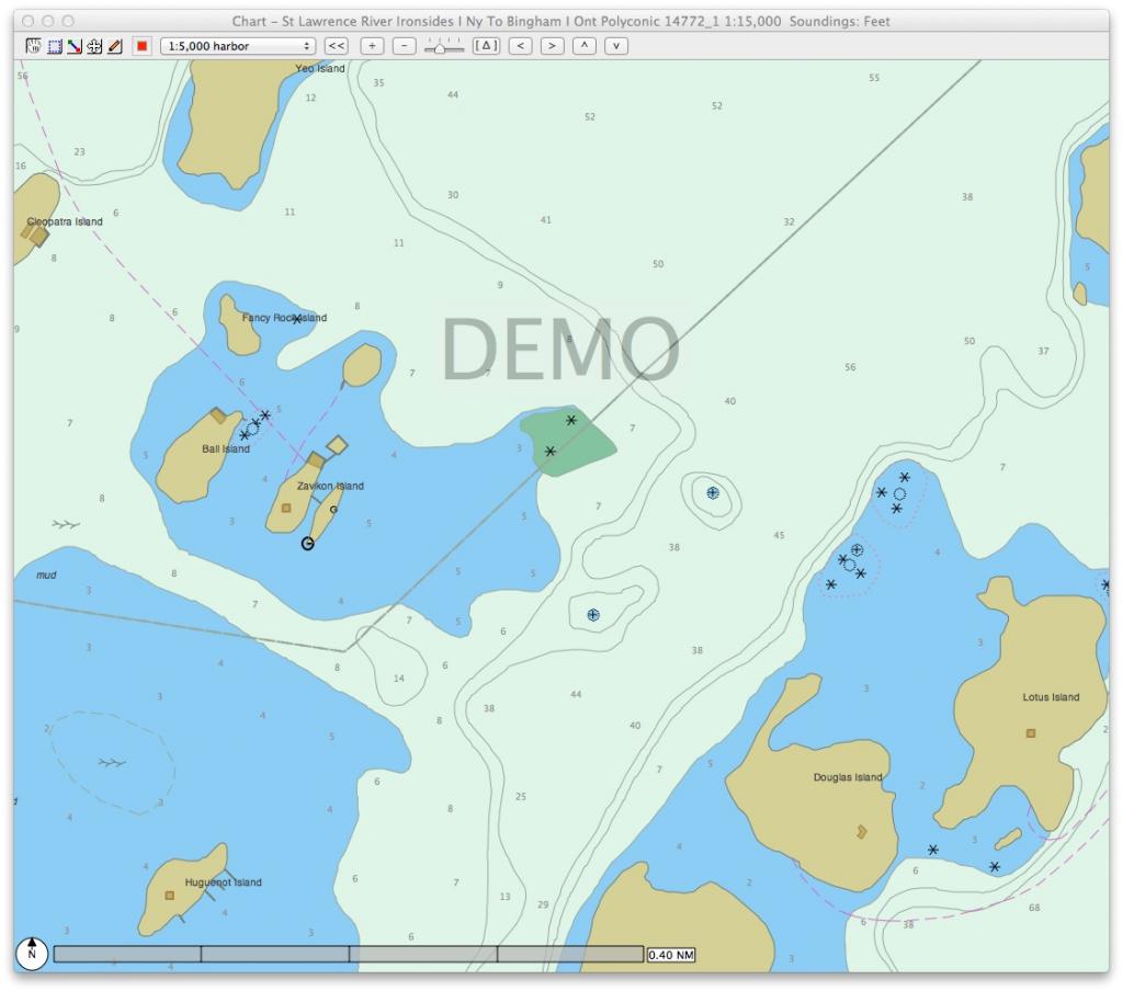
NOAA Vector chart ... using MacENC application … zoomed …
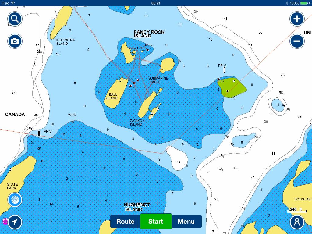
Navimatics app and chart ... seems to be derived from NOAA vector chart … does not offer much if any enhancements to NOAA charts … the app supports ActiveCaptain and I use it for AC data mostly …
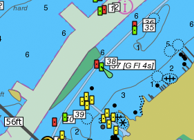
Garmin BlueChart app and chart ... seem to provide some enhancements to NOOA charts … they are very similar to the charts I see on my Garmin chartplotters minus the bathygrahic data and satellite imagery overlay available on GARMIN chartplotters with BlueCharts G2 Vision charts installed … but the BlueChart app supports Active Captain … note the US/Canada border problem ...
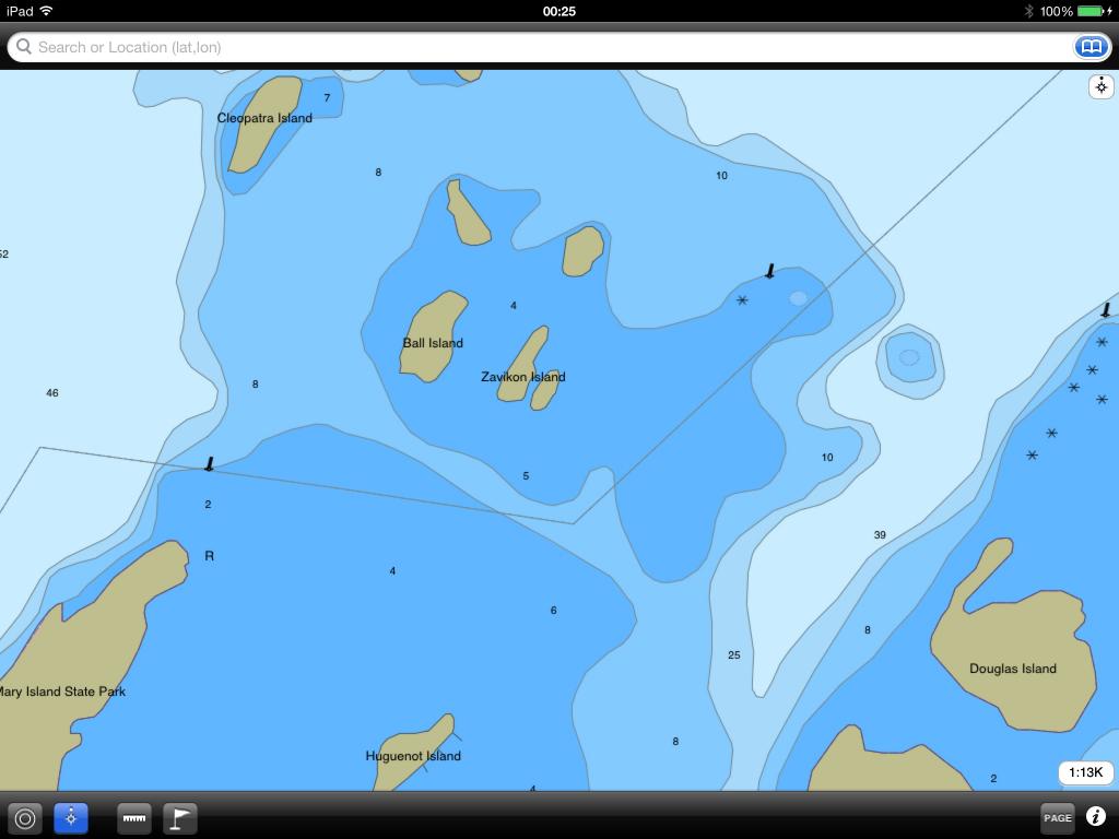
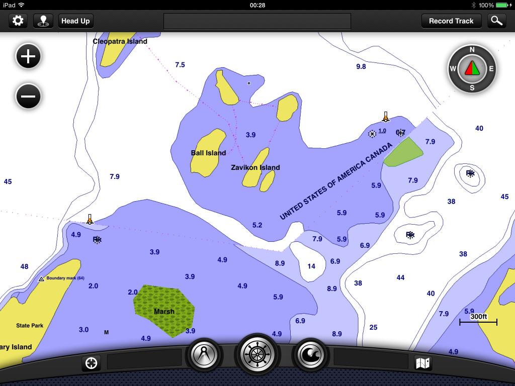
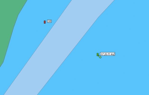
Navionics app and chart … they offer some added value but the app does not support ActiveCaptain (yet?) … normal view … the dotted shallow area is an app feature that allows user to highlight the shallows, it is set at 6 feet here ...
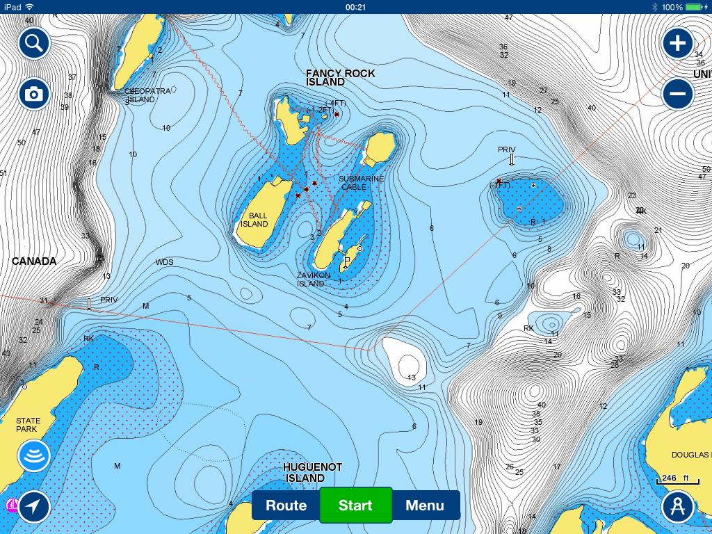
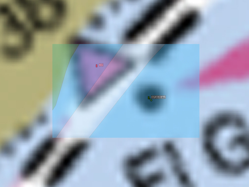
Navionics app and chart … zoomed view with bathygraphic data …
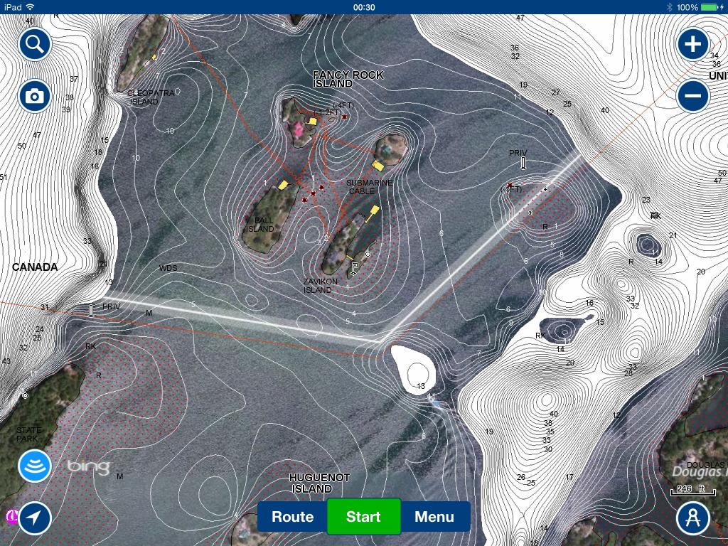
Navionics app and chart … zoomed view with bathygraphic data and satellite imagery overlay … one thing worth noting here is the updated and correct placement of all human made structures on the shoreline …
Hope this helps ...