Wayfarer
Guru
- Joined
- Aug 29, 2014
- Messages
- 2,228
- Location
- USA
- Vessel Name
- Sylphide
- Vessel Make
- Kingston Aluminum Yacht 44' Custom
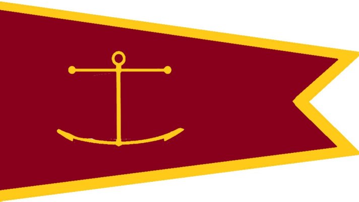
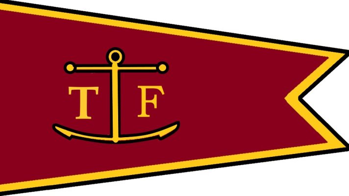
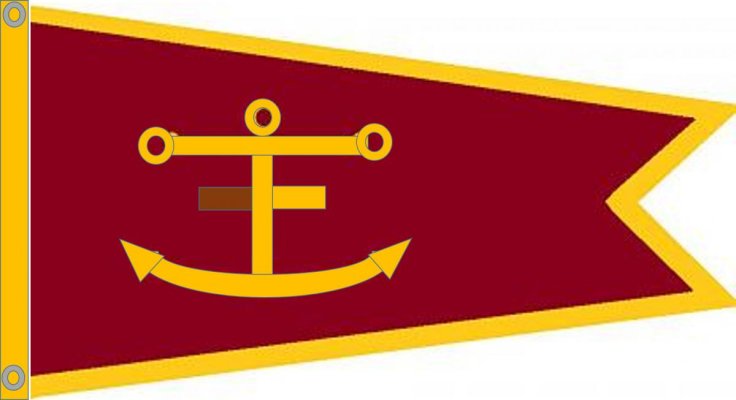
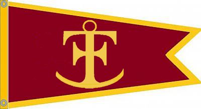
That said, my preference would be:
- Simple design that works without creating a double sided flag. This makes it less expensive.
- Nothing complex, such as the TF logo.
- Something that stands a chance of being recognized at a distance with binoculars.
I agree. Simple is good. I'd prefer something without text. I like the Red and Gold color palette to match the logo / site colors


 That works for me.
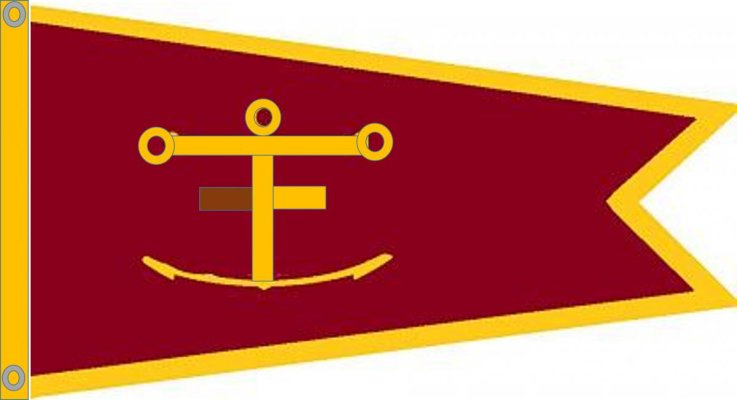


")